You’re building a website, and you know that every pixel counts. But have you ever stopped to consider the humble icon? They may be small, but their impact is monumental. In this article, we’ll explore why icons are crucial in web design, the different types you can use, and best practices to ensure they’re contributing to, rather than detracting from, your overall design. Are you ready to level up your web design game?
Why Icons Matter in Web Design
Visual Appeal
Imagine a web page full of text, just a barren landscape of words. Pretty boring, huh? Icons break the monotony, adding aesthetic richness to your design. They can effectively represent complex ideas or actions in a manner that’s easy to grasp at a glance.
User Experience
Icons enhance navigation and guide users through your website, improving the user experience. Well-placed icons can lead a user through a process more smoothly than text alone. Think of them as your website’s signposts; without them, users can easily get lost.
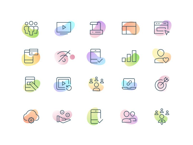
Different Types of Icons Used in Web Design
Static Icons
These are your run-of-the-mill, standard icons. While they may lack the razzle-dazzle of animated or interactive icons, they’re reliable and get the job done.
Animated Icons
A step above static icons, animated icons are like the cool kids of the web design world. They engage users with their motion but should be used sparingly to avoid overwhelming the design.
Interactive Icons
This is where the magic happens. Interactive icons react to the user’s actions, such as hover or click, enhancing user engagement and experience.
Choosing the Right Icons
Consistency is Key
Having mismatched icons is like wearing stripes with polka dots— it’s a no-go. Stick to a consistent theme and style across all icons for a cohesive look.
Size and Scaling
One size doesn’t fit all when it comes to icons. Make sure your icons scale well across devices without becoming pixelated or distorted.
Color and Contrast
Color can make or break your design. Choose colors that align with your overall theme and make sure there’s enough contrast so that the icons stand out.
Mistakes to Avoid
Overcomplicating Design
Sometimes, less is more. Avoid cramming too much detail into an icon; it can become confusing rather than clarifying.
Ignoring Accessibility
Icons need to be easily understood by everyone, including those with visual impairments. Always provide alternative text for your icons.
Case Studies
Successful Icon Implementation
Companies like Apple and Google are experts at using icons to enhance user experience. Simple, intuitive, and aesthetically pleasing, their icons serve as excellent examples to emulate.
Failures and Lessons
We all remember the disaster that was Microsoft’s Clippy. Overcomplicated and annoying, it taught us valuable lessons in what not to do when it comes to icon design.
Icons are the unsung heroes of web design. When used effectively, they can make your website visually appealing and user-friendly. By understanding the types of icons available, maintaining consistency, and avoiding common mistakes, you can ensure that your icons have the maximum impact on your website’s success. So, are you ready to start optimizing your web design icons?
FAQs
- What are the benefits of using icons in web design?
- Icons enhance visual appeal and improve user experience by guiding navigation.
- How can I choose the right icons for my website?
- Consider your overall design theme, and make sure to maintain consistency in style, size, and color.
- Can I use animated or interactive icons?
- Yes, but use them sparingly to avoid overwhelming the user.
- What are common mistakes in using icons?
- Overcomplicating the design and ignoring accessibility are common pitfalls.
- Where can I find good examples of icon use in web design?
- Companies like Apple and Google are known for their effective use of icons; their websites can serve as excellent inspiration.
Emerging Trends: The Future of Web Design Icons
Brief History of Web Design Icons
Remember the days when web design icons were merely pixelated little images? It feels like a lifetime ago, doesn’t it? Icons have come a long way in the world of web design, evolving from crude bitmap graphics to the slick and interactive elements we see today.
Importance of Icons in Web Design
Icons are the unsung heroes of web design. They’re like the spices in a delicious dish—subtle but essential. They guide the user and offer a pleasing visual experience.
The Evolution of Web Design Icons
The Evolution of Web Design Icons: From Bitmap to SVG
A Nostalgic Look at Bitmap
In the earlier days of the internet, Bitmap (BMP) was the workhorse of image file formats. You can think of Bitmap like the original Nintendo games—functional but limited in graphics. These Bitmap icons were pixel-based, meaning each icon was a grid of tiny squares, each representing a single color. These images did their job but had several drawbacks:
- Limited Scalability: Ever tried to stretch an old photo and noticed how it becomes distorted? Bitmap suffers from the same problem. Enlarge it, and it becomes pixelated. Shrink it, and you lose detail.
- Larger File Sizes: Bitmap files could be relatively large, affecting a website’s load time, especially for those with slower internet connections.
- Less Flexibility: With Bitmap, what you see is what you get. You can’t easily manipulate individual components of the icon.
The Advent of SVG
Now, picture SVG (Scalable Vector Graphics) as the modern gaming console. It’s a flexible, dynamic, and responsive solution. SVG uses XML to describe 2D graphics that can be scaled indefinitely without losing any quality. Here’s why SVG is a game-changer:
- Fully Scalable: SVG can be resized without any degradation in quality. It’s like having a stretchable rubber band as opposed to a rigid stick.
- Smaller File Sizes: SVG files are generally smaller than their Bitmap counterparts, which means faster load times for web pages.
- Interactivity and Animation: SVG allows for elements to be animated or interacted with, making your icons not just pretty but also functional.
The Rise of Material Design and Flat Icons
What Is Material Design?
In 2014, Google introduced Material Design, a design language that uses shadow effects, movement, and depth to create a more realistic and interactive user interface. Imagine going from a two-dimensional Monopoly board to a three-dimensional video game—it’s just more engaging and lifelike.
The Allure of Flat Icons
Flat icons are a simplified, two-dimensional style of icons that gained popularity alongside Material Design. These icons avoid the use of textures, gradients, and realistic lighting, focusing instead on simplicity and usability. They’re like the minimalist home décor trend but for the web—simple, clean, and efficient.
In essence, Material Design and flat icons have done for web icons what color did for black and white television—they’ve added depth, flair, and a whole new layer of user interaction.
I hope this provides a more detailed look at how web design icons have evolved over the years. Let me know if there’s anything else you’re curious about!
Why Are Icons Important?
Why Are Icons Important?
Visual Aesthetics: More than Just Eye-Candy
Picture walking into a room painted entirely in one color with no decor. It would be functional, sure, but would you want to spend much time there? Probably not. Similarly, a webpage that consists solely of text would be incredibly dull and unlikely to engage visitors for long. This is where icons come into play; they add an aesthetic appeal that can make or break a user’s interaction with a site.
Icons are like the sprinkles on a sundae or the cherry on top of a cake. They add color, shape, and interest, making the page more visually pleasing. Well-designed icons can:
- Break up Large Blocks of Text: Icons can serve as visual breaks in long passages, making content easier to skim and digest.
- Convey Brand Identity: Through color, style, and imagery, icons can subtly communicate the message and feel of a brand.
- Make Content Memorable: A well-placed, striking icon can make an impression, making your content more memorable to users.
User Experience: Navigational Signposts and More
Think of icons as your website’s tour guides. When done right, they don’t just sit there looking pretty; they actively improve the user’s experience. Imagine you’re in a new city. You could wander around, occasionally getting lost, or you could follow the signs and know exactly where to go and what to expect. In a similar fashion, icons serve as:
- Signposts: They guide the user’s navigation through the website, making it easier to find relevant sections or features. An envelope icon for the ‘Contact’ section, a magnifying glass for ‘Search’, and a cart for ‘Shopping’ are almost universally recognized, for instance.
- Quick Information Delivery: Icons can quickly convey information without requiring text. For example, a thumbs-up or star icon can instantly signify approval or a favorite without needing any accompanying text.
- Accessibility: For those with visual impairments or language barriers, icons can provide additional cues that text alone might not convey.
- Visual Consistency: Consistent icon usage throughout a site provides a cohesive, intuitive user experience. It’s like visiting a series of shops in a mall that all have clear and consistent signage—you know what to expect and where to find things.
To summarize, icons aren’t just a ‘nice-to-have’ design feature; they are essential for both the visual aesthetics and the user experience of a website. They serve as both the beauty and the brains of a well-designed webpage, ensuring that users are not just drawn in but also find their stay both intuitive and enjoyable.
Speed and Responsiveness
In our fast-paced world, speed is the name of the game. Icons help web pages load faster compared to heavier graphic elements.
Current Trends in Web Design Icons: Setting the Tone for the Future
The Move to Minimalism: Less Is More
In a world drowning in information and visual stimuli, minimalistic design in web icons is like a breath of fresh air. Think of it like Marie Kondo’s approach to tidying up but applied to web design—keep only what brings joy, or in this case, functionality and user engagement. Here’s why minimalistic icons are gaining traction:
- User-Centric: These simplified icons are designed with the user in mind. Their uncomplicated forms mean that they’re quickly and easily understood, eliminating the cognitive load on the user.
- Versatility: Minimalistic icons are like a pair of classic black pants—they go with anything. Their simplistic nature allows them to fit seamlessly into various designs and layouts.
- Focus on Core Actions: By stripping down to essentials, these icons guide users more effectively towards core actions, like ‘Buy’, ‘Read More’, or ‘Contact Us’.
- Future-Proofing: Trends come and go, but simplicity is timeless. Opting for a minimalistic approach can give your website longevity.
The Rise of Animated Icons: Because Static is So Last Season
Why should icons be any different from the rest of our interactive, dynamic digital world? Animated icons are the natural next step in the evolution of web design. Imagine them as emojis, but with a bit of a kick. Here’s why they’re trending:
- Engagement: Just like a good storyteller uses gestures to keep the audience engaged, animated icons capture attention and make users more likely to interact.
- Functional Feedback: Animated icons can provide real-time feedback. A simple animation can confirm a button press or indicate a loading process, improving user experience.
- Storytelling: Beyond mere decoration, these icons can tell a story or guide a user through a process, like a tour guide leading you through a historic site.
3D Icons: Adding a New Dimension to User Experience
Remember the first time you saw a 3D movie? The experience was immersive, right? 3D icons aim to deliver a similar level of interaction and realism. They’re not just icons; they’re miniature experiences. Let’s break down the appeal:
- Depth and Realism: 3D icons offer a tactile experience, making digital interactions feel more lifelike.
- Visual Hierarchy: The added depth can help establish a visual hierarchy on the page, guiding the user’s eye and actions more effectively.
- Interactive: By simulating real-world objects, 3D icons can make user interactions more intuitive. Imagine a trash can icon that looks like you could actually drop something into it.
- Memorable: Just as a pop-up book makes a lasting impression compared to a standard print, 3D icons are likely to stick in a user’s memory.
To wrap up, the trends in web design icons are a mirror reflecting broader shifts in technology and user expectations. From the clean lines of minimalistic design to the dynamic movements of animated icons and the immersive experiences offered by 3D icons, the future of web design icons is anything but static.
The Role of AI and Machine Learning in Shaping Web Design Icons
Automated Design: Icons that Know You Better Than You Do
Could you ever imagine a day when your web icons are essentially mind-readers? Well, that day is not far off thanks to the advent of AI algorithms in design. These aren’t just any icons; they’re your personal icons, optimized to your tastes and behavior. Here’s how it’s happening:
- Personalization: AI algorithms can analyze user behavior and preferences to suggest or modify icons accordingly. For instance, if you frequently visit the sports section of a news site, an AI-designed homepage might highlight sports-related icons for you.
- Efficiency: Let’s face it, time is money. Automated design speeds up the design process by generating icon options based on best practices and user data, allowing designers to focus on other critical elements.
- Adaptability: These AI-generated icons can adapt to various screen sizes, resolutions, and platforms without losing their aesthetic appeal or functionality. It’s like having a wardrobe that adjusts itself to the weather!
Dynamic Icons: Icons That Learn Your Language
You’ve heard of machine learning algorithms that recommend songs or movies based on what you’ve enjoyed in the past, right? Now, think of that technology applied to web design icons. Here’s why it’s groundbreaking:
- User-Centric Evolution: Based on your interactions, machine learning allows these icons to evolve. For instance, if you consistently ignore a particular icon, it may be replaced with one that better suits your usage pattern.
- Context-Aware: Imagine an icon that changes based on the time of day or your current activity. Reading a lot of business articles? The icon could transform into something more formal or industry-specific.
- Enhanced Engagement: Dynamic icons keep the user interface fresh and engaging. It’s like talking to someone who knows you well; they always know how to keep the conversation interesting.
- Data-Driven Decisions: The ongoing machine learning process continually collects data on user interactions, helping designers make more informed decisions on icon placement, appearance, and functionality.
To sum it up, AI and machine learning are taking web design icons to a whole new level. They’re not just making them prettier or more interactive; they’re making them smarter and more attuned to the user’s needs. It’s a brave new world, where your icons don’t just sit there on the screen; they learn, adapt, and evolve, just like you do.
So next time you see a particularly engaging or useful icon while browsing, take a moment to appreciate the complex technology and innovation that might be working behind the scenes, making your digital experience better one icon at a time.
Responsive Design and Adaptive Icons: The Chameleons of the Web World
The Importance of Adaptivity: One Icon Fits All
In today’s digital landscape, users are accessing websites and apps from an array of devices—smartphones, tablets, laptops, and even smart TVs. Your icons need to be as adaptable as a chameleon changing its colors to match its environment. Why is this so crucial?
- Universal Accessibility: Whether someone is viewing your website on a 4-inch smartphone or a 27-inch monitor, the icons should be clear, understandable, and clickable. It’s about making sure every user’s experience is consistent.
- Optimized User Experience: Adaptivity in icon design contributes to a seamless user experience. Imagine reading a book where the font size suddenly jumps from 12-point to 48-point midway. Jarring, right? The same principle applies to icons.
- Brand Consistency: When your icons adapt but still maintain their essential design elements, your brand’s identity remains consistent across all platforms. It’s like having different flavors of the same ice cream; different but fundamentally the same.
Real-World Examples: Android’s Adaptive Icons
One stellar example of adaptivity in icon design comes from the Android operating system. If you’ve ever used different Android devices, you may have noticed that app icons often change shapes—sometimes they are rounded, other times square or squircle (yes, that’s a real shape). Here’s how they do it:
- Shape Shifting: Android’s adaptive icons can alter their shapes based on the device or theme in use. This feature ensures that icons maintain a harmonious appearance, in line with the device’s overall design language.
- User Customization: Some Android interfaces allow users to choose the shape they prefer, adding an extra layer of personalization.
- Dynamic Interactions: These adaptive icons also support animated interactions, enhancing user engagement. Imagine an icon that not only changes shape but also reacts when you interact with it—like a pet that wags its tail when you pet it.
In summary, responsive design and adaptive icons are not mere buzzwords; they are essential design philosophies that cater to the diversified digital habits of contemporary users. By being as adaptable as chameleons, these icons ensure a visually cohesive and interactive experience for users across the board. And as screen sizes and platforms continue to evolve, the adaptivity of icons will only become more crucial in the design playbook.
Future Trends in Web Design Icons: The Sci-Fi Edition
Augmented Reality (AR) Icons: From Screen to Reality
You’ve seen augmented reality in games and apps, but what about web design icons? The future holds possibilities that are nothing short of astonishing. Imagine walking into your living room and interacting with an icon that floats in your physical space. Sound futuristic? Well, the future is closer than you think. Here’s what AR could bring to web design icons:
- Immersive Experience: AR icons could provide an all-encompassing, 360-degree interaction experience. No longer limited to your screen, these icons would be a part of your actual environment.
- Real-World Applications: Imagine pointing your phone at your washing machine and an AR icon pops up, guiding you through settings or troubleshooting. This extends the utility of icons beyond the digital sphere into real-world applications.
- Enhanced Engagement: Interacting with an icon in a real-world setting would certainly capture attention more than a static icon on a webpage. It’s like the difference between watching a movie and being in the movie.
Voice-Activated Icons: Talk to Your Icons
We’ve been talking to our phones and smart home devices, but what if we could communicate with our icons directly? As voice search and voice commands become increasingly integrated into our daily digital experience, it’s only a matter of time before voice-activated icons become commonplace. Here’s how it could work:
- Hands-Free Interaction: Picture this, you’re cooking with messy hands and need to set a timer. Just say, “Hey Siri, open the timer icon,” and you’re good to go—no touch required.
- Accessibility: Voice-activated icons could make web and app navigation more accessible for individuals with physical or visual impairments.
- Streamlined User Experience: Combining voice commands with icons can lead to a smoother, more efficient user experience. Imagine not having to sift through a multitude of icons; just say what you need, and it’s right there.
In conclusion, the trends shaping the future of web design icons are exciting and bound to revolutionize how we interact with digital platforms. From augmented reality to voice activation, the next generation of icons is set to break the boundaries of conventional design and user interaction. It’s an exciting time to be involved in web design, where the icons of the future could very well feel like something straight out of a science fiction novel.
How to Stay Updated: Your Roadmap to Being an Icon Trendsetter
Blogs and Resources: Daily Dose of Design Wisdom
In the ever-evolving field of web design and particularly icon design, the best way to stay in the loop is by consuming information. Blogs, articles, and e-newsletters can serve as your daily or weekly dose of design wisdom.
- Reliable Blogs: Websites like Smashing Magazine, Webdesigner Depot, and CSS-Tricks offer insights from experts and cover the latest trends in web design and iconography.
- Online Forums: Places like Reddit’s web design subreddit or specialized design forums are goldmines of peer advice and current trend discussions.
- E-newsletters: Subscribing to newsletters from authoritative design platforms can give you a curated list of the latest articles, trends, and tools directly in your inbox.
Courses and Tutorials: Invest in Your Skills
Reading about new trends is one thing, but implementing them is another ball game. Courses and tutorials are the bridges that convert theoretical knowledge into practical skills.
- Online Courses: Websites like Udemy, Coursera, and Skillshare offer comprehensive courses on web design that often include modules on the latest trends in icon design.
- Tutorials: YouTube is chock-full of tutorial videos that demonstrate the ins and outs of new design techniques, including those for icons.
- Hands-on Workshops: Keep an eye out for workshops or webinars that offer real-time experiences. These often come with the added benefit of networking opportunities.
Staying updated in the fast-paced world of web design icons is much like surfing; you have to catch the wave right on time to enjoy the ride. Following reliable resources and investing in skill-enhancing courses can make sure you’re not just riding the waves but making them.
Whether we’re talking about the early days of bitmap images or the futuristic concept of AR and voice-activated icons, one thing is clear—the world of web design icons is both dynamic and revolutionary. The key to staying relevant in this realm lies in continuous learning and adaptability. And luckily, with a plethora of resources, courses, and community wisdom at our disposal, staying ahead of the curve has never been easier.
Challenges and Concerns: The Flip Side of Progress
Complexity: The Double-Edged Sword
While advancements in web design icons, such as 3D, AR, and voice-activation, are exciting, they come with their own set of challenges. One of these is complexity. As icons evolve to include more advanced features and functionalities, they also become more complicated to design and implement.
- Technical Requirements: Advanced icons often require specialized software and skills, making them less accessible to designers who are just starting out.
- Performance Concerns: Heavily designed or overly complex icons can slow down a webpage’s load time, adversely affecting the user experience and SEO rankings.
- User Adaptability: Not all users are tech-savvy. Icons that are too complex can be confusing or intimidating to some users, hampering overall accessibility.
Over-reliance on Automation: The Creativity Drain
Automation is a blessing in disguise. It’s great for repetitive tasks and can even help in creating icons that adapt to user behavior. However, over-reliance on automation can be detrimental.
- Loss of Originality: When machine algorithms take over the creative process, designs risk becoming generic. After all, a machine doesn’t have that human touch of creativity and emotion.
- Limited Scope for Customization: Automated design templates can be rigid, offering little room for custom modifications or unique flairs.
- Risk of Homogenization: When everyone uses the same automated tools, designs across different platforms can start to look eerily similar, causing a loss of brand distinctiveness.
Web design icons have come a long way from simple bitmap images to potential augmented reality and voice-activated experiences. While these advancements are exciting, it’s important to acknowledge and address the inherent challenges they bring, such as complexity and the risk of over-automation. After all, being forewarned is being forearmed, right?
Web design icons have evolved dramatically over the years and will continue to do so. From minimalistic designs to the potential advent of AR and voice-activated icons, the future looks exciting. The key is to adapt and evolve with these changes, keeping user experience at the forefront.
FAQs
- What are the advantages of SVG over Bitmap?
- SVGs are scalable without losing quality, making them ideal for modern web design.
- What is Material Design?
- Material Design is a design language developed by Google, which focuses on grid-based layouts and responsive animations.
- Why are animated icons becoming popular?
- Animated icons catch the user’s attention and make the user experience more engaging.
- How is AI affecting web design icons?
- AI allows for automated and dynamic icon designs, making the experience more personalized.
- What are adaptive icons?
- Adaptive icons can change their appearance based on the device or platform they are displayed on.